The Rubii platform offers a variety of chart types to enhance data visualization and analysis. This article outlines the available chart types—Pie, Donut, Line, Combo, and Bar—along with their unique features and use cases.
Donut Chart
The Donut chart is similar to a Pie chart but with a central hole, making it easier to compare proportions by category. It provides an intuitive way to visualize numerical proportions.
Use Cases
- Visualizing market share among competitors.
- Showing distribution of campaign performance across different channels.
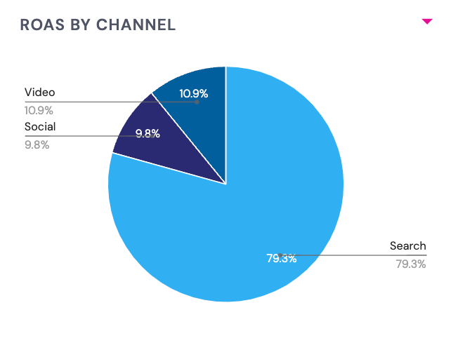 Pie Chart
The Pie chart is a circular graphic divided into slices to illustrate numerical proportions. Each slice represents a category's contribution to the total, making it easy to see relative sizes at a glance.
Use Cases
- Visualizing market share among competitors.
- Displaying contribution to total performance metrics.
Line Chart
The Line chart is a graphical representation of data points connected by a line, used to show trends over time.
Use Cases
- Analyzing performance trends over a specific period.
- Comparing multiple data sets to identify relationships.
Combo Chart
The Combo chart combines two types of charts (e.g., Bar and Line) to visualize data with different scales or to show trends and totals together.
Use Cases
- Comparing multiple metrics with different scales.
- Visualizing trends and totals in one view.
Bar Chart
The Bar chart represents data with rectangular bars, with the length of each bar proportional to the data value. This chart is ideal for comparing categories.
Use Cases
- Comparing performance across categories or time periods.
- Showing the breakdown of data by subcategories.